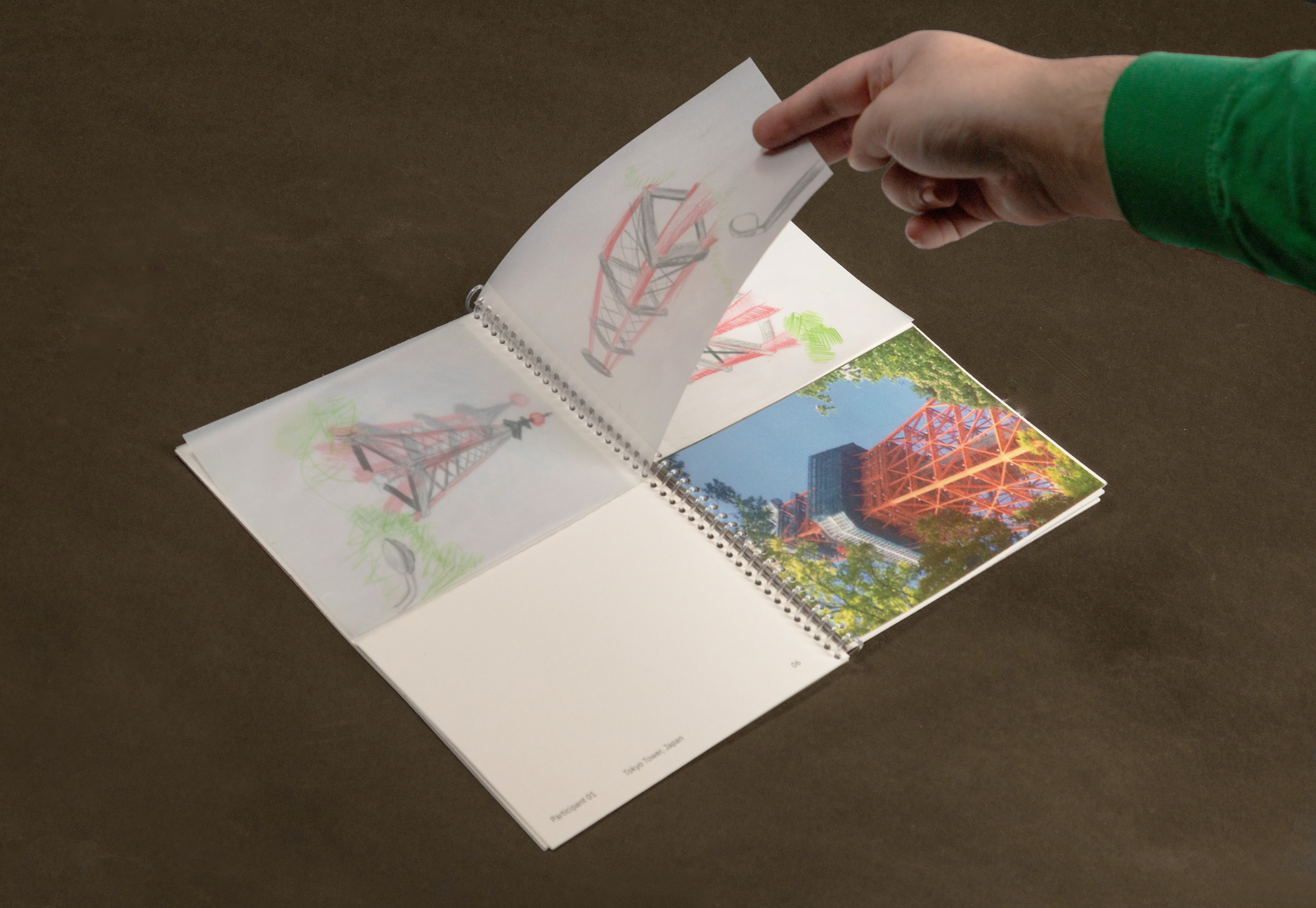
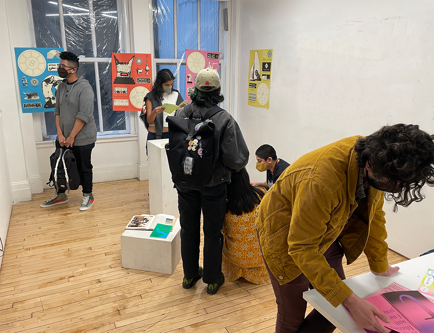
AL-HANEEN MISKEEN
Al-Haneen Miskeen is an ongoing body of work that explores our relationship to nostalgia and how it can be visualized, recorded, and shared. It looks at how cultural ephemera from our past can shape our present and inform our future.
All the work was showcased in a Pop-up hosted in the Parsons Building.
Degree project at Parsons School of Design supervised by Andrew LeClair


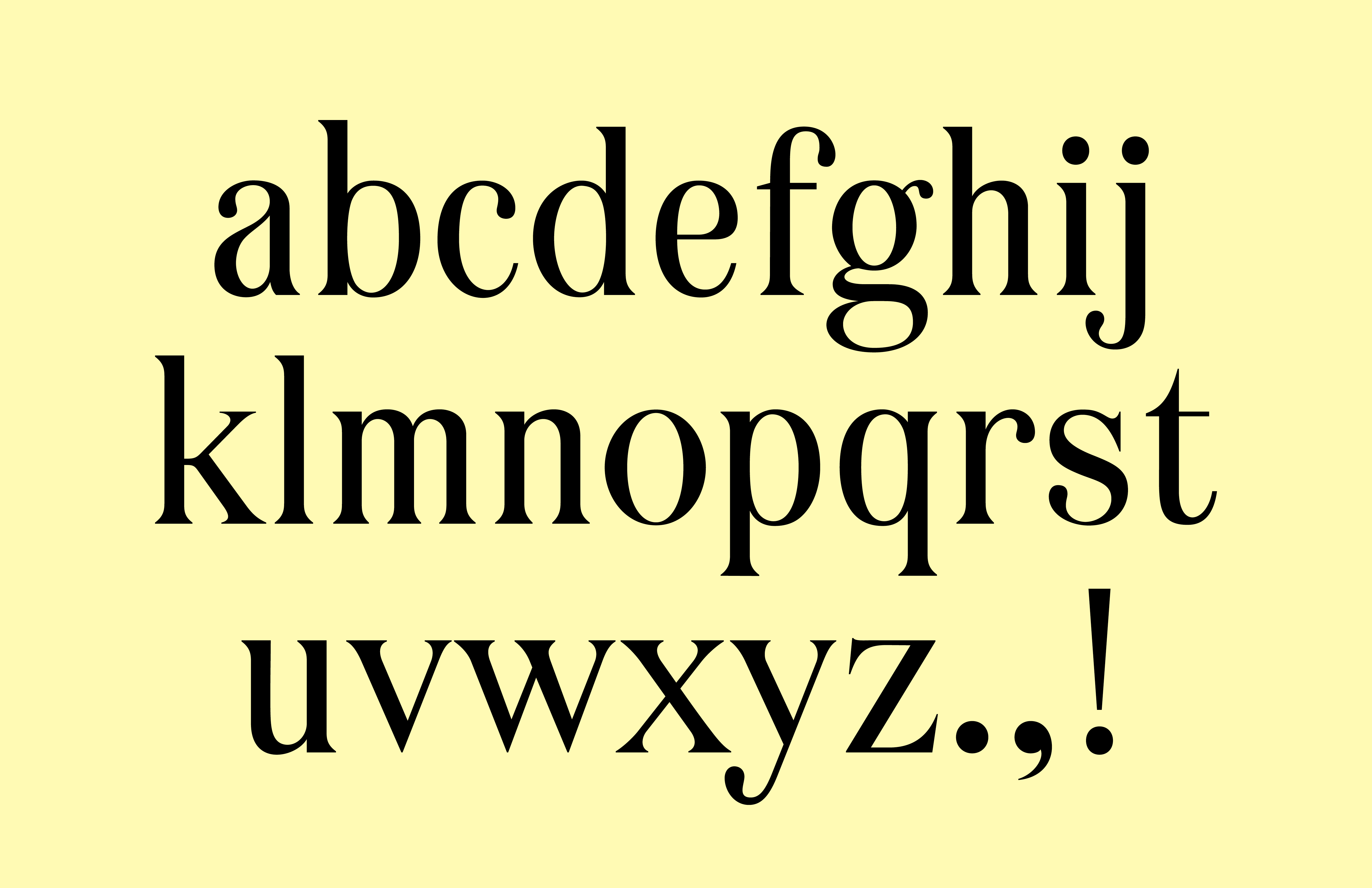
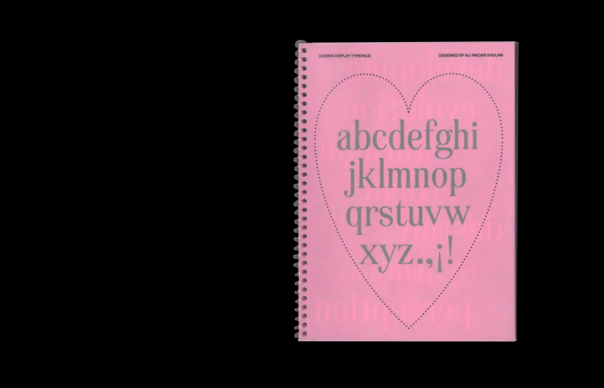
DOMINA DISPLAY REGULAR
Domina Display Regular is a modern serif typeface that echoes Didot and Bodoni; it features high contrast between vertical and horizontal strokes as well as ball terminals.
The typeface’s expected release is Fall 2022, with full lowercase and uppercase alphabets, numbers, basic symbols, and Spanish support.


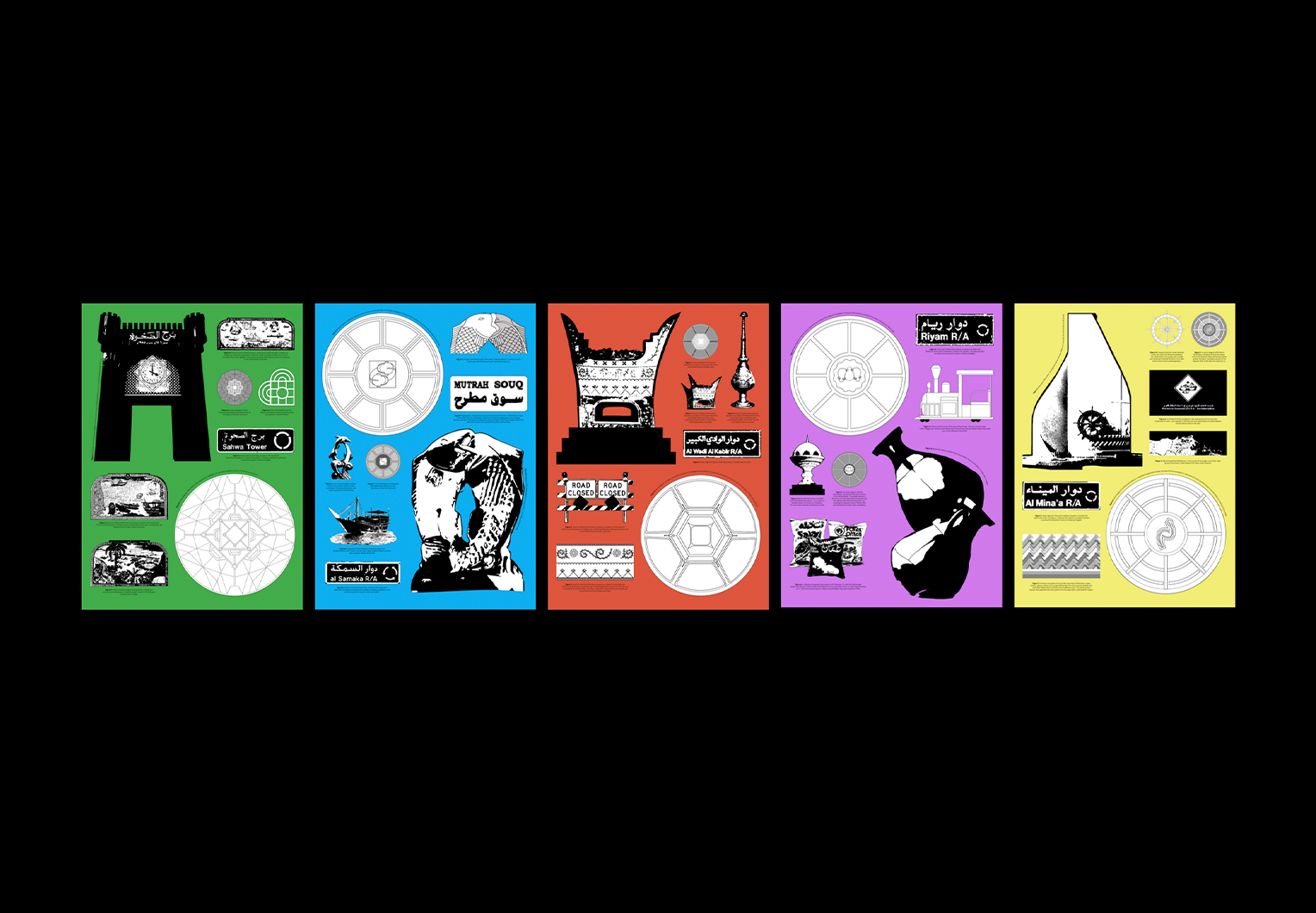
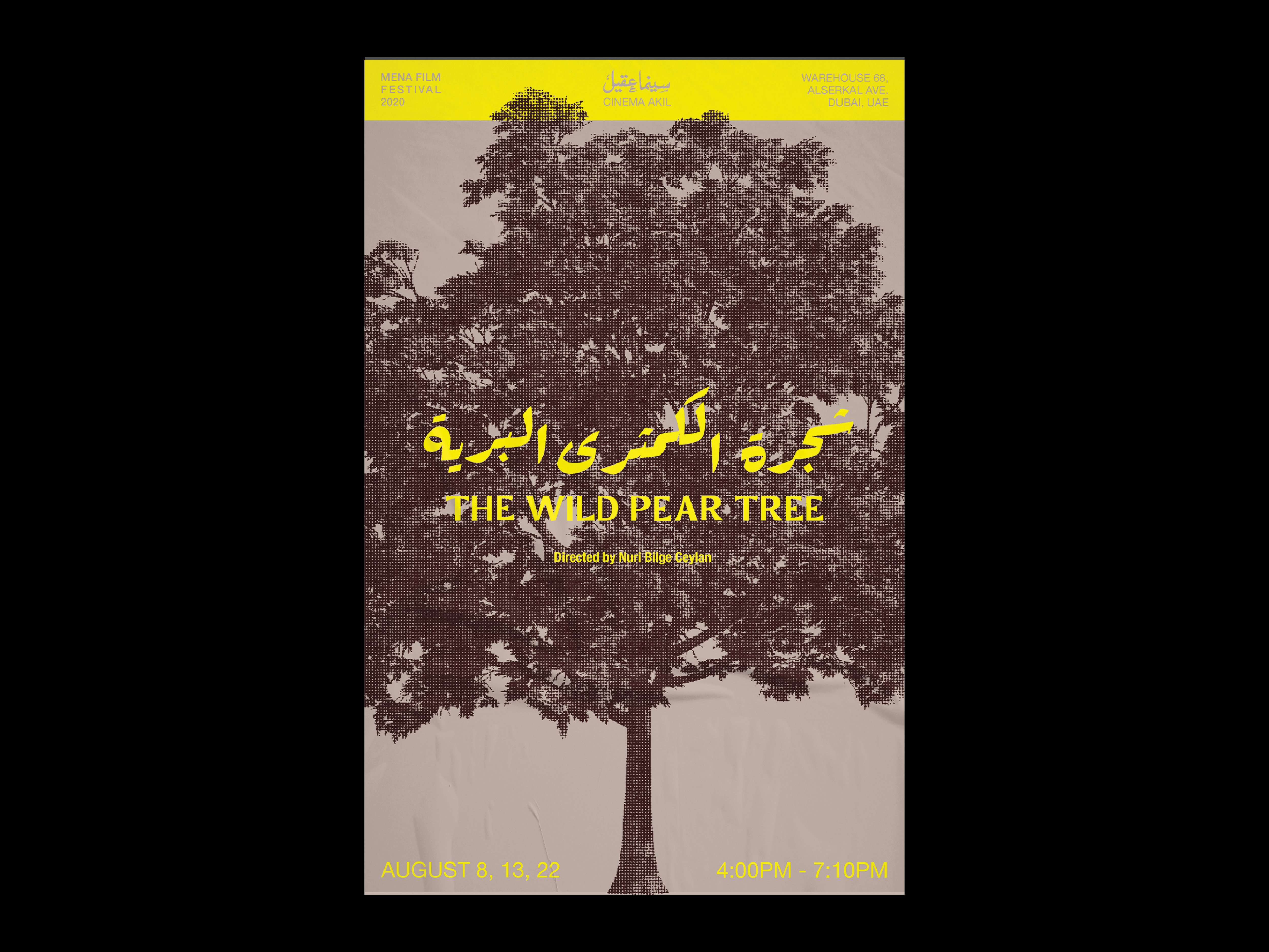
MENA FILM FESTIVAL POSTERS
This Emirates based imaginary film festival highlights five indie films from the Southwest Asian and North African region (SWANA).The posters served as branding for the festival and they feature Arabic typography reminiscent of film from the mid to late 20th century.
A custom Latin typeface was developed from Rakkas to distinguish it from its formal and classic predecessor; it is called Rakkas Sans.


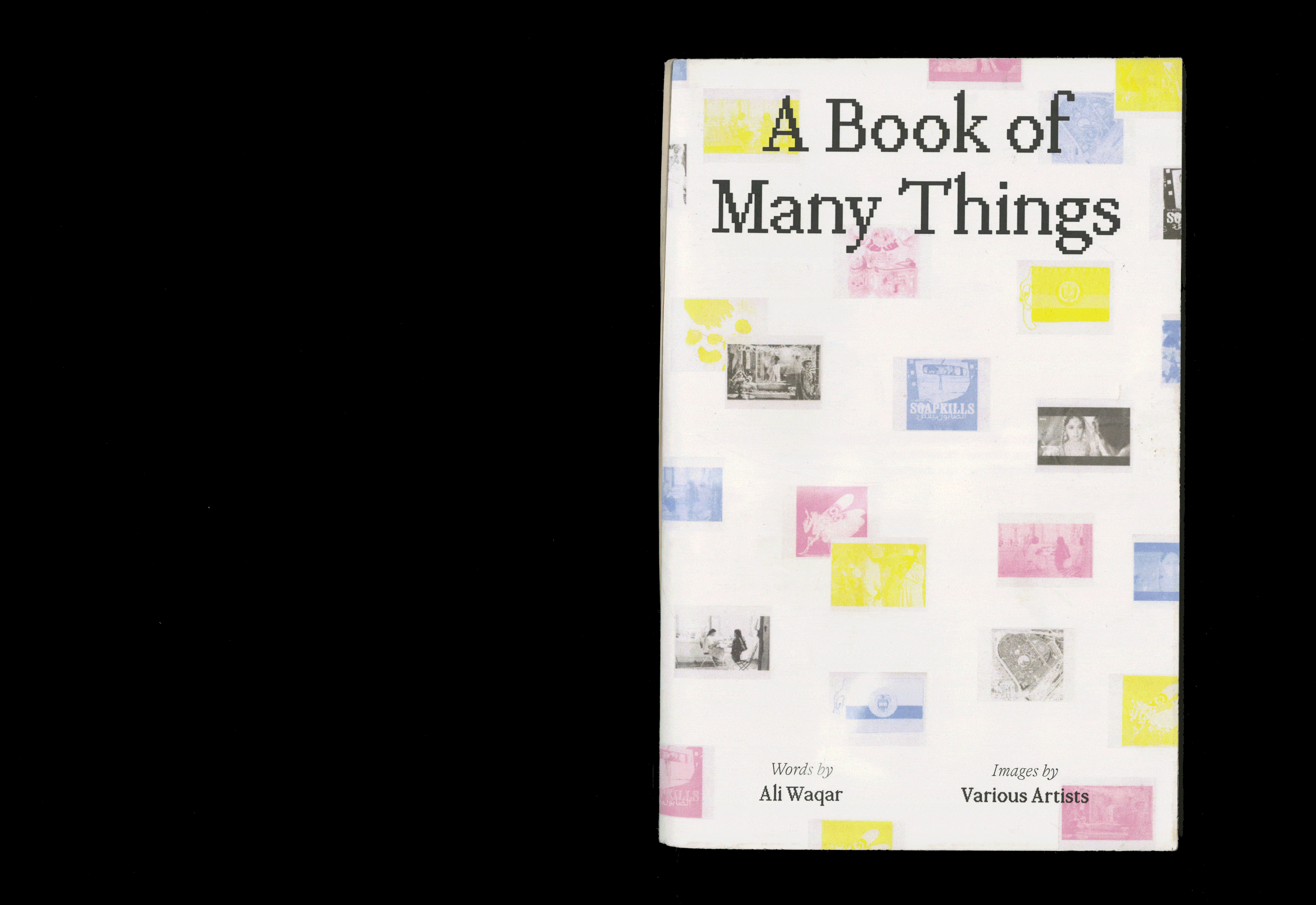
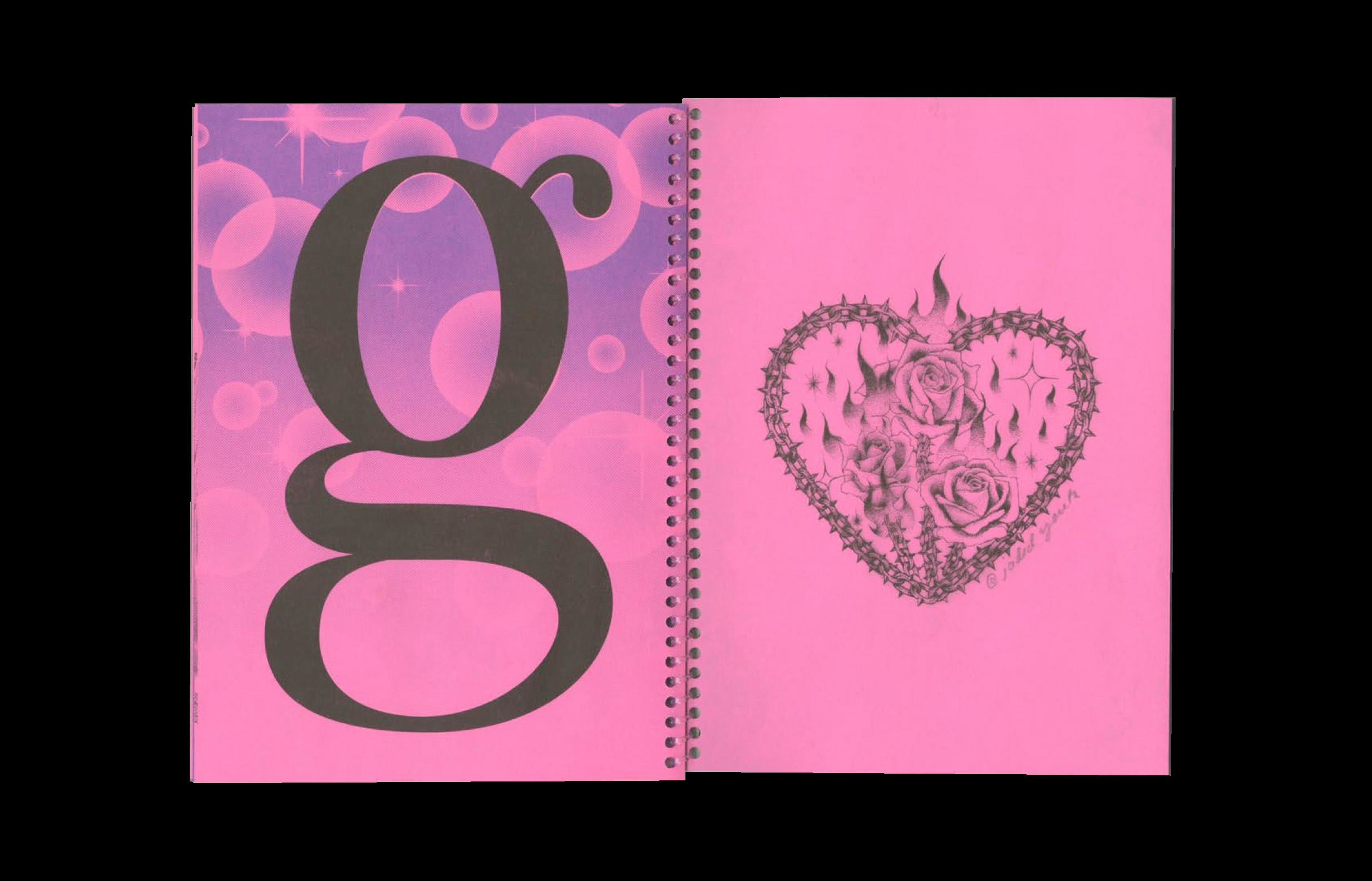
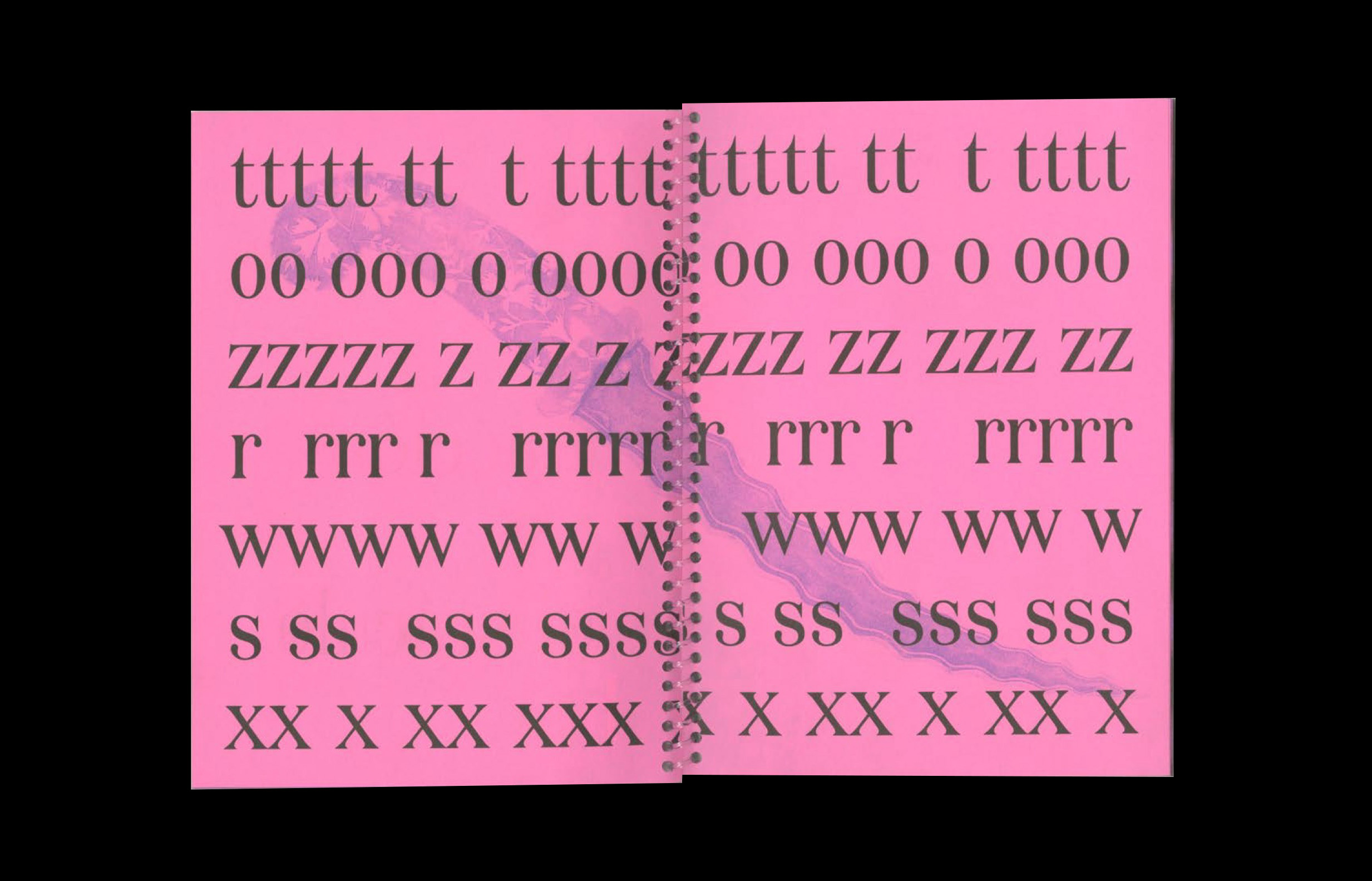
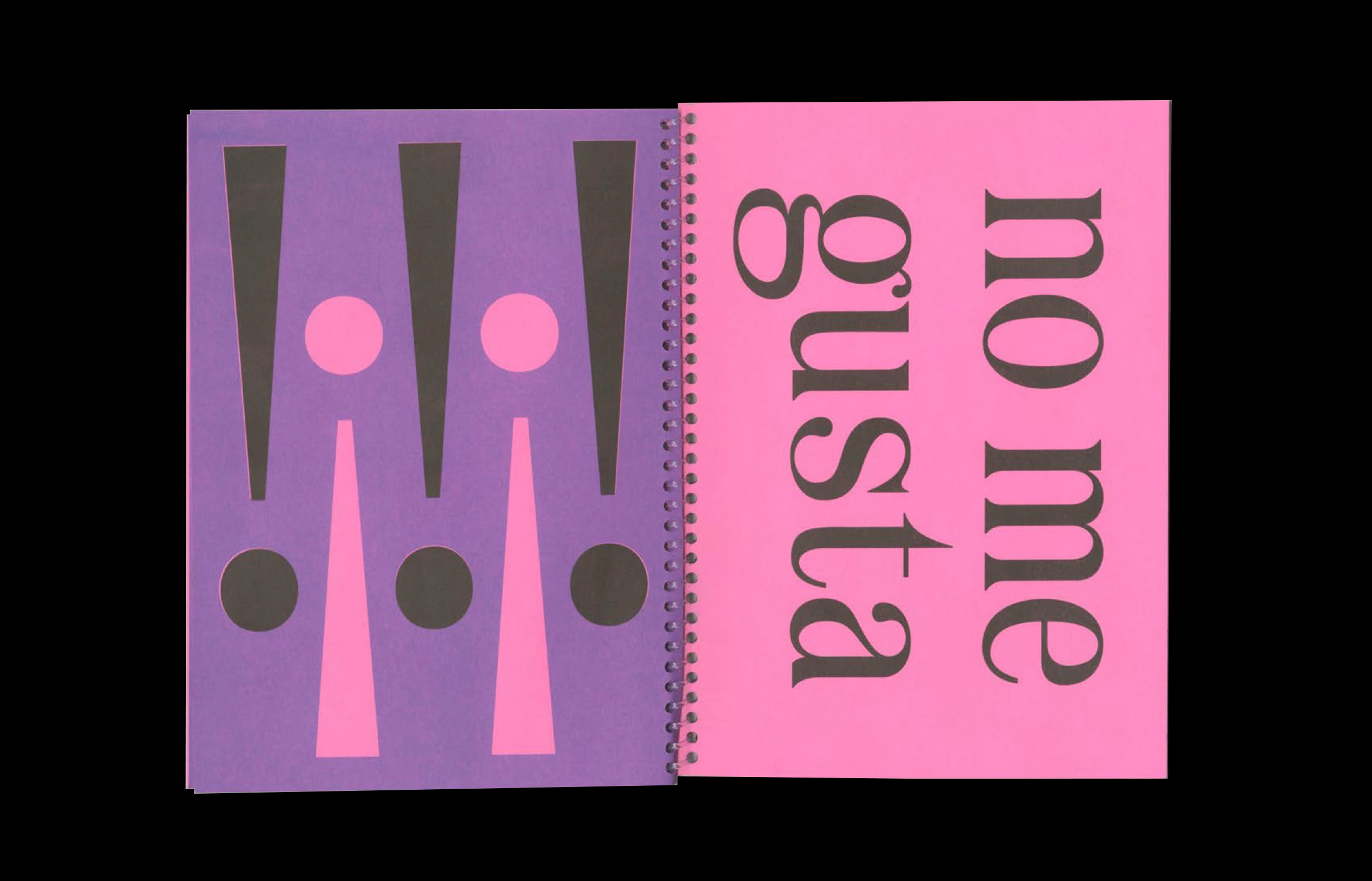
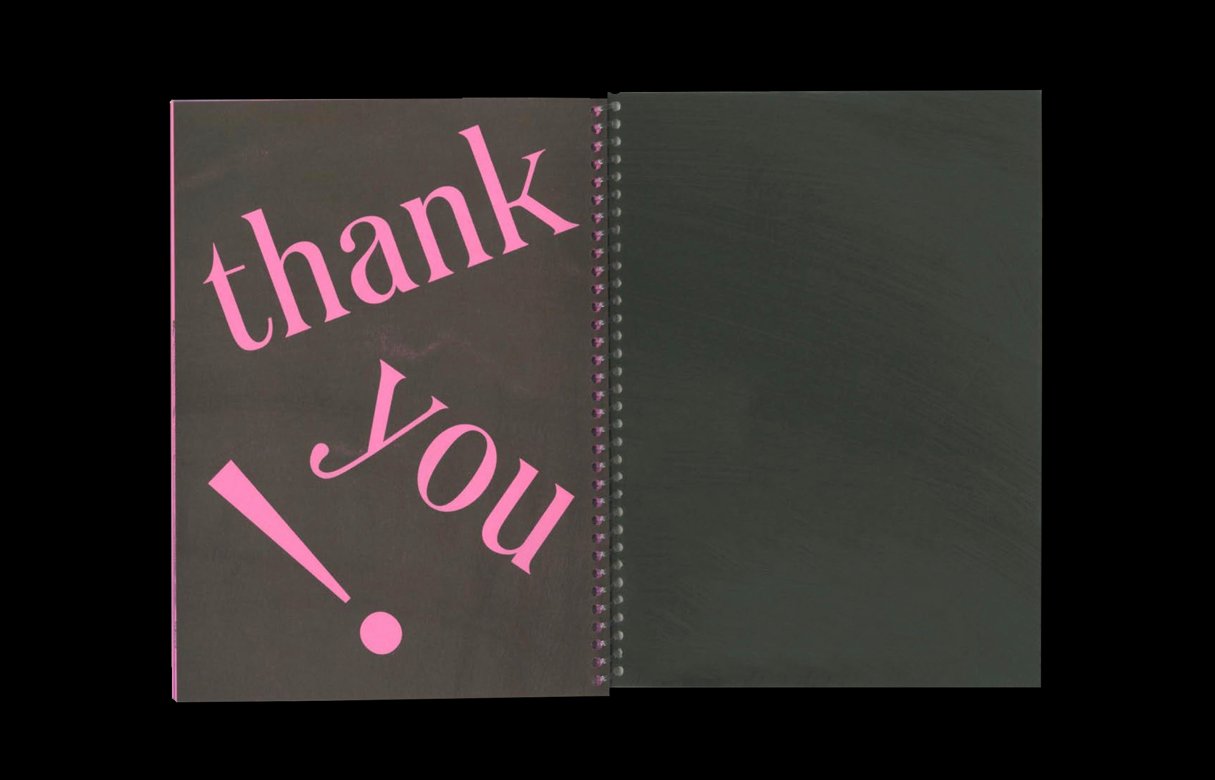
BOOK OF MANY THINGS
Can we understand more about ourselves from the images we are drawn to? What associations can be made through comparing and contrasting said images? And how can we use the knowledge we gain to better understand and depict ourselves.
This project explores these questions vie working back and forth between the risograph and indesign.
6” x 9” rubber bound booklet